Creative Director · Program Manager · Author
Ren
Dela Cruz
Creative direction. Program management.
PMP certified. Lean Six Sigma Green Belt. Twenty years of work before I had the vocabulary for it — events that drew thousands, a language school that became a publishing platform, a volunteer system rebuilt from nothing. The credentials followed. The work came first.
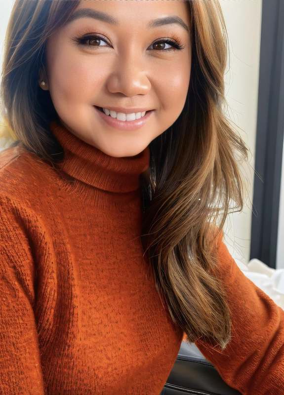
I started making things early, mostly out of necessity. My parents were frugal, and the house had its own rules about what girls were and weren't handed — so a lot of "no's" turned into "okay, let me figure out how to make one myself." It became a habit more than anything else, and it's stayed with me. There often aren't the resources I want for my son either, so I build them.
Every project on this page, whatever the medium, comes from that same place — and from loving to create with a community and for a community, not just alone at a desk.
— Ren
Collect the food, the family, the fun. Survive the tsismis (gossip).
Filipino family gatherings have a specific, recognizable energy — the lechon at the center, the tita (auntie) who's got the latest gossip, the godfather who shows up late but still controls the room. Salo Salo Sabotage turns that into a 90-card deck: collect three Food, three Family, and three Fun before a Bagyo (typhoon), a Brownout, or somebody's Tita's Tea takes them back. Every counter in the deck is a real cultural value, not just a rule — Kapwa (shared identity), Utang na Loob (a debt of gratitude), Mano Po (a gesture of respect). Designed, illustrated, and taken all the way to manufacturing.
The idea actually started at a D&D table — thinking about what an unbeatable final boss Tita would look like, then falling down the rabbit hole of how you'd actually take her down. Her own oversized tablecloth. Her own tsismis (gossip), turned into a weapon.
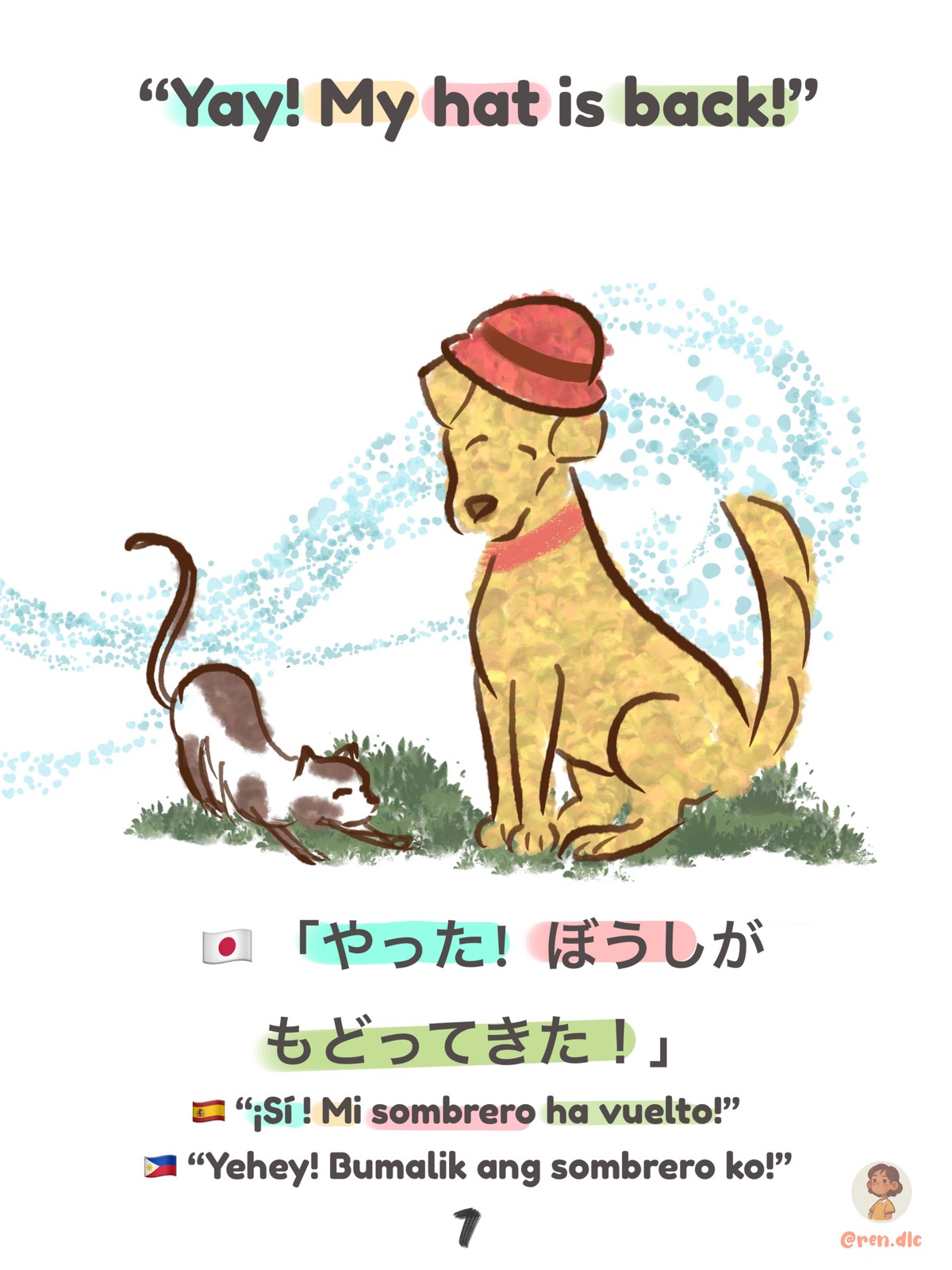
Made for my son, the same reason I wrote When Lola Speaks. Culture doesn't pass down by accident — it gets played at a table until it sticks.
More illustration work — full illustration portfolio →The real units were still stuck in transit when it came time to launch, so the whole shoot was built instead of filmed — props styled, lighting and color direction set by hand, every composition art-directed frame by frame. Every card, every hand, every surface here is a composited mockup, held to the same look and pacing as real product footage until the units cleared customs.
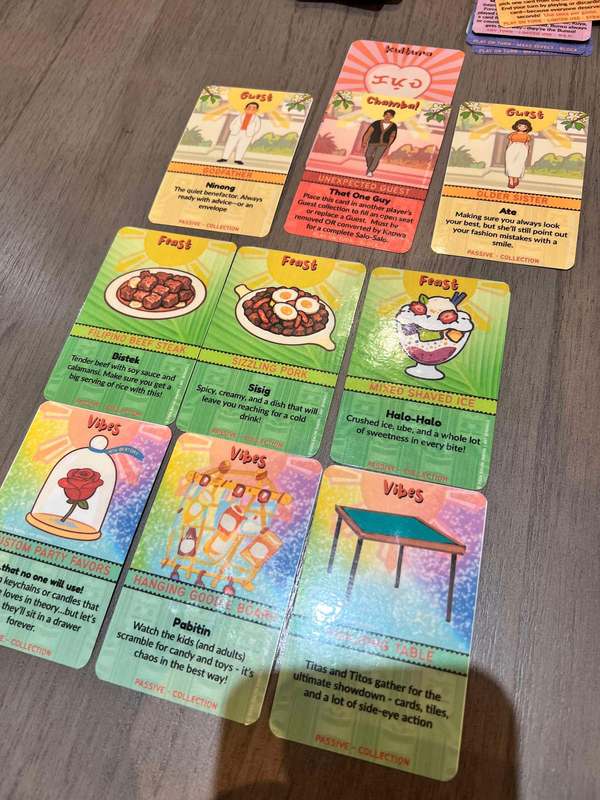
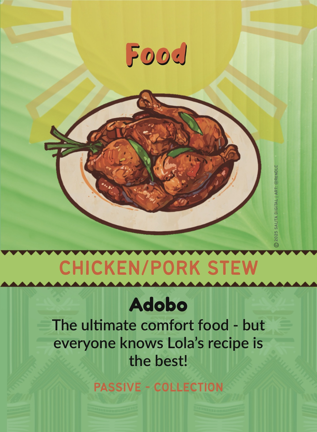
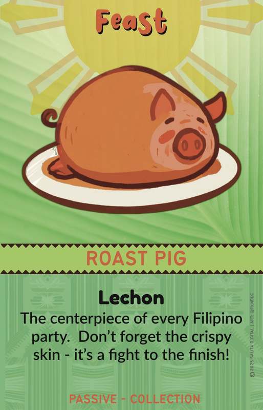
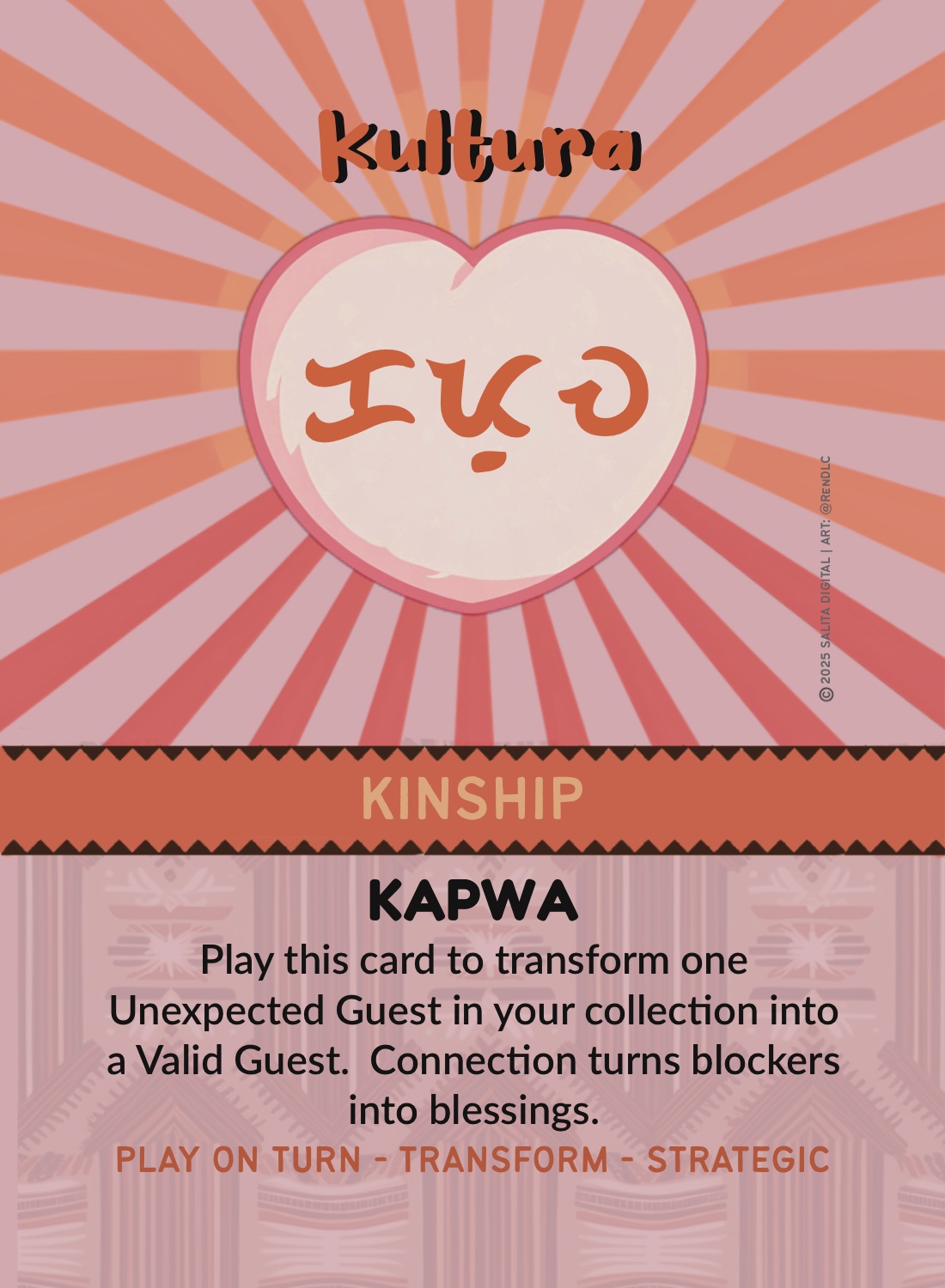
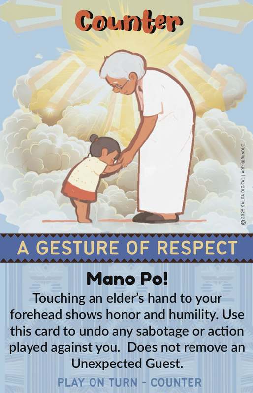
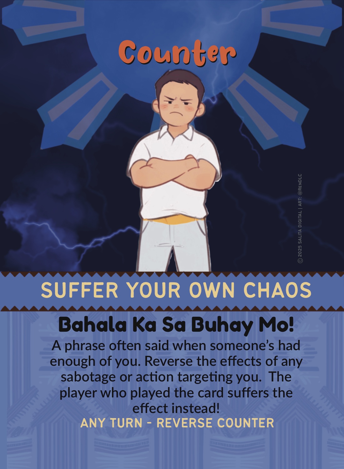
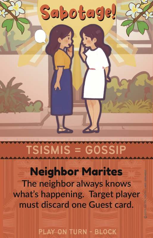
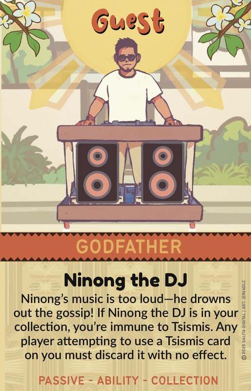
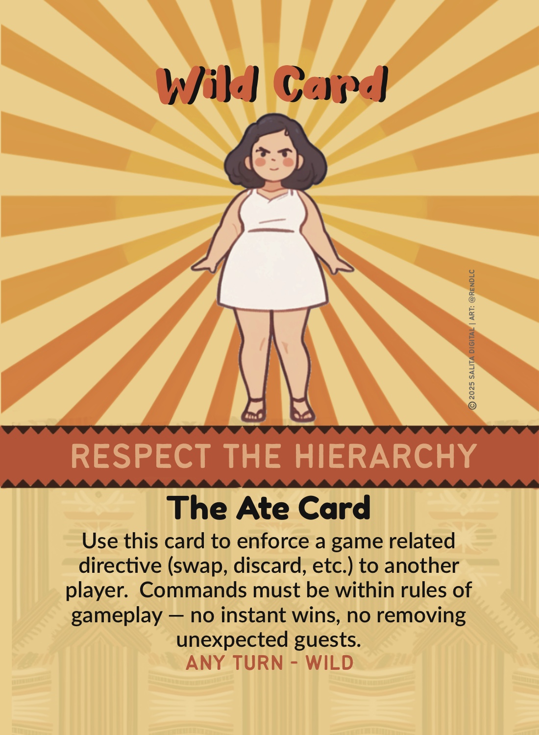
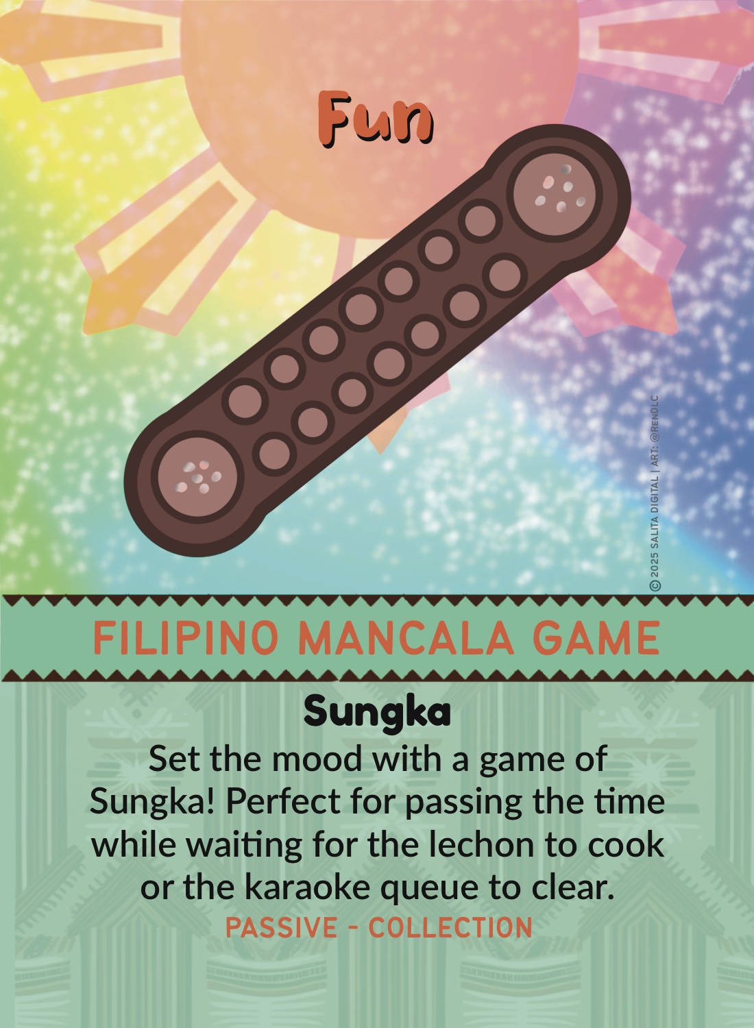
Every guest card is framed the way you'd actually see them arrive — on the walkway, at the gate. The borders trace the geometry of Filipino tribal tattoo. Every description sits over a woven banig (sleeping mat) pattern. Banana leaves stretch behind the food cards, and the same eight-ray sun from the flag rises behind every guest. None of it is labeled — but the first time someone flips a card and says wait, my lola has that placemat, it's already working.
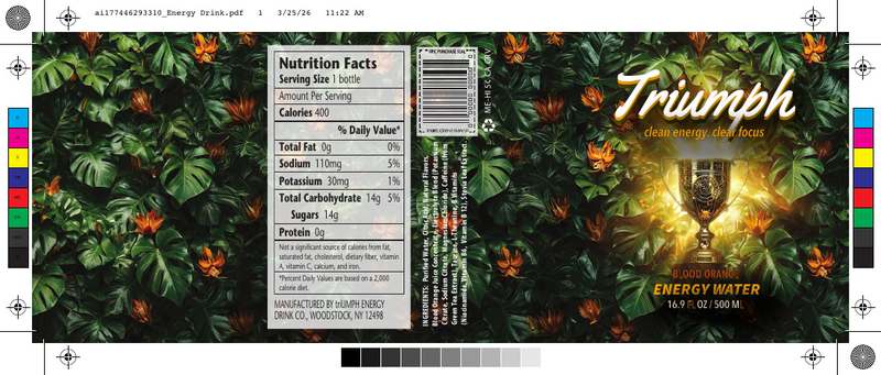
The box went through a full concept round before landing on the direction that shipped — then had to survive being turned into an actual print-ready file, with fold lines, bleed, and a barcode that scans.
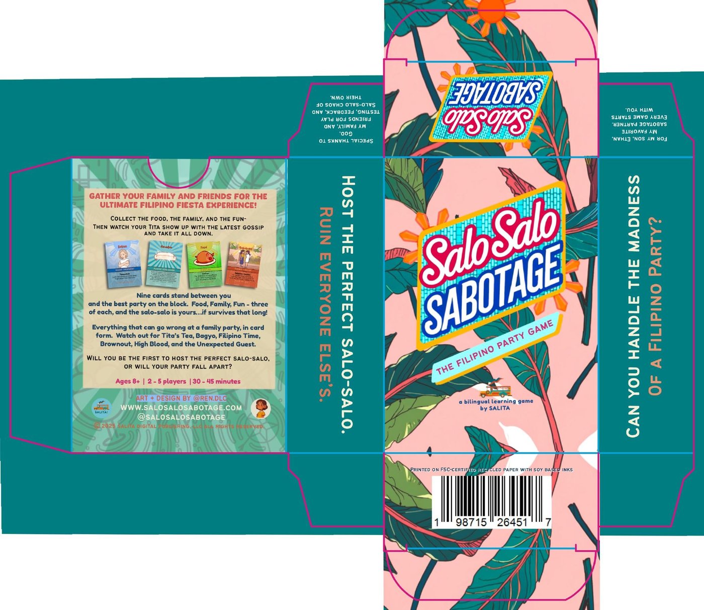
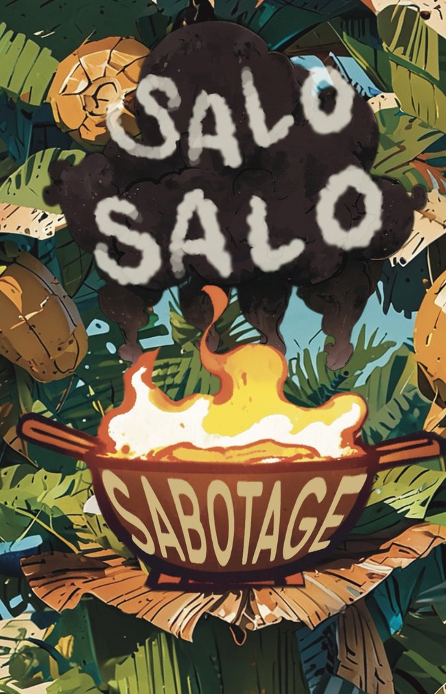
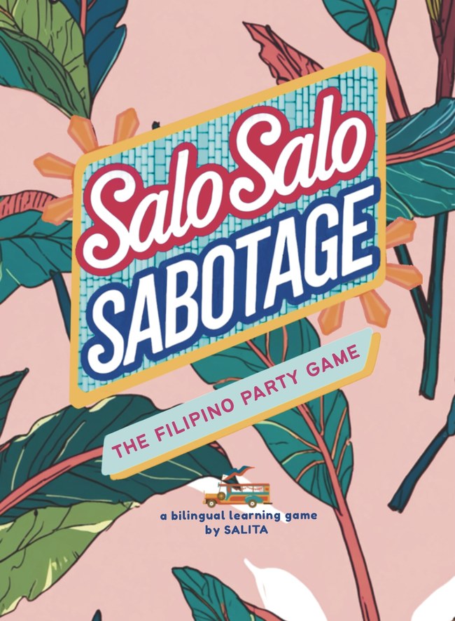
Rules in English and Filipino. If you grew up at those tables — recognition. If you didn't — introduction. Printed in Richmond, CA on FSC-certified recycled paper with soy-based inks.
Visit salosalosabotage.com → See the site build ↓ Web & DigitalClient brief. Clean execution.
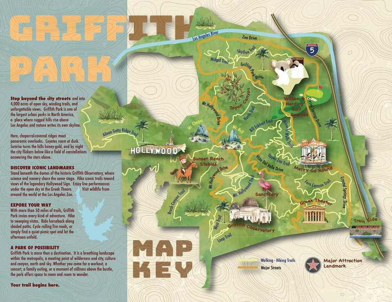
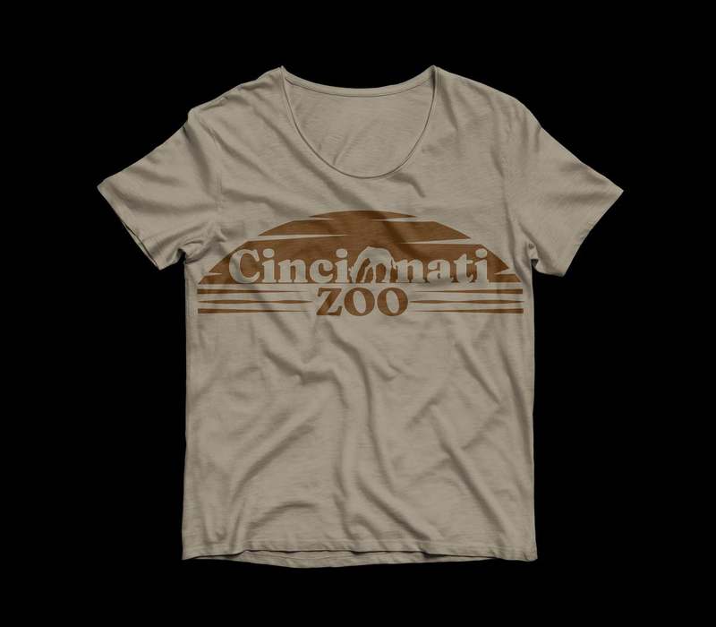
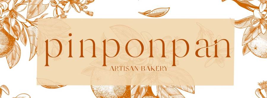
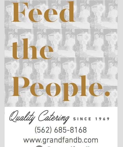
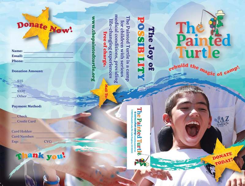
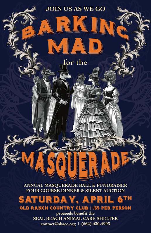
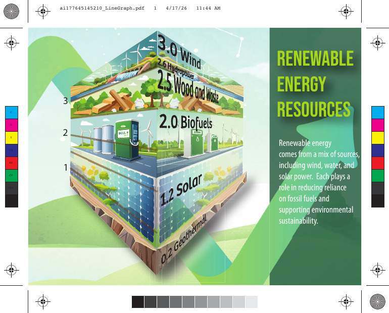
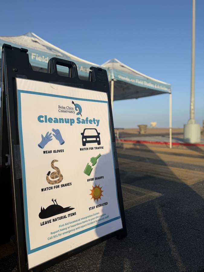
Each piece was designed against a real brief — art director notes, actual constraints, production specs. The Pinponpan identity and Bolsa Chica Conservancy signage shown elsewhere were real client work. The rest were designed for a program that used genuine art director scenarios.
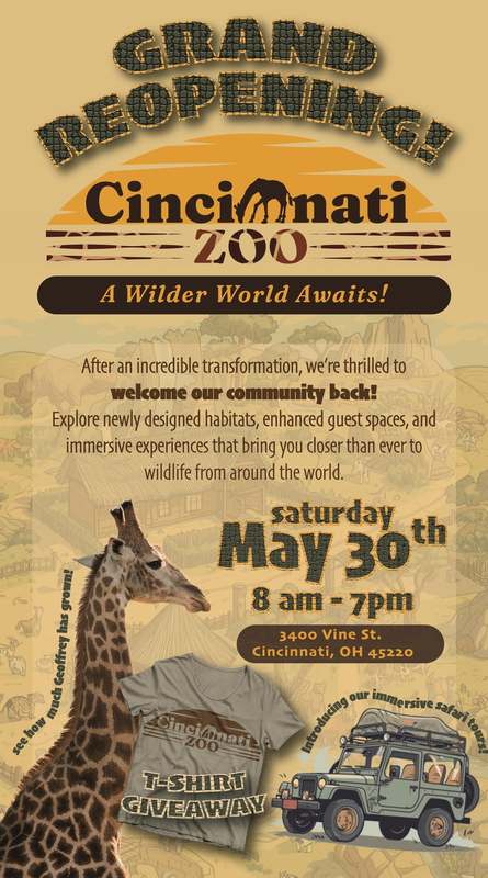
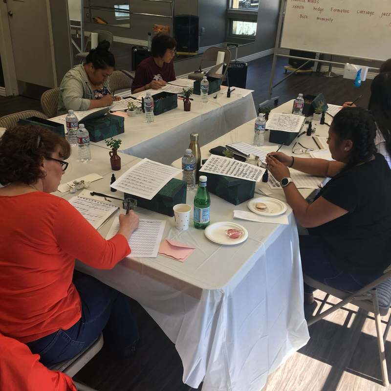
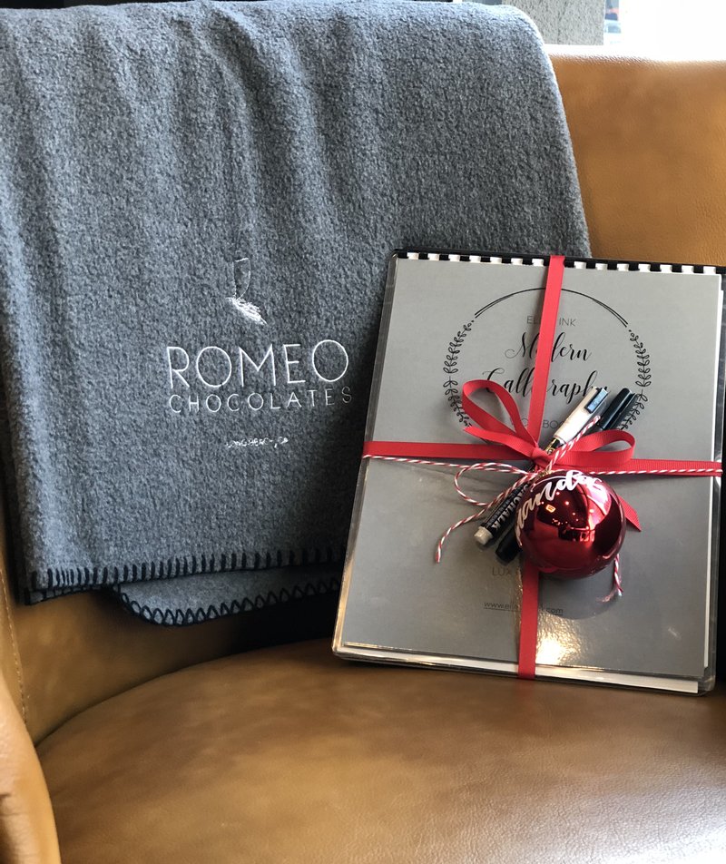
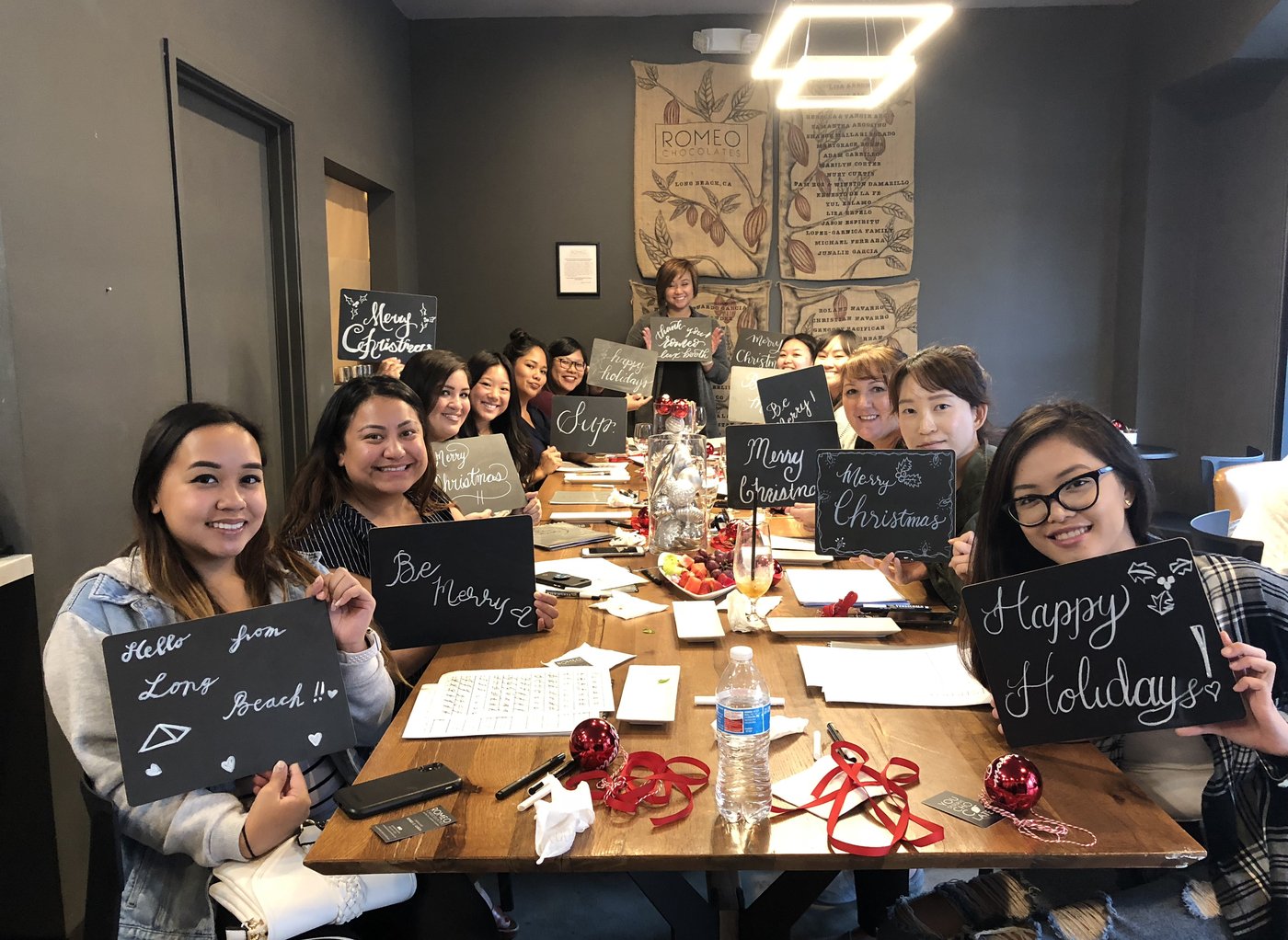
Same curriculum, hosted again — this time for the holiday opening of Romeo Chocolates' Long Beach shop. A full table of guests, most of them picking up a calligraphy pen for the first time, left with a chalkboard piece of their own.
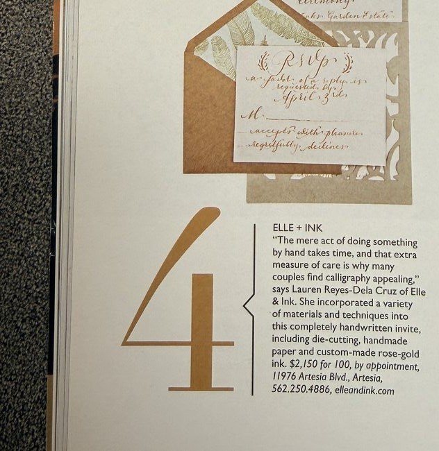
One of four California calligraphy studios profiled in a feature on the all-calligraphy invitation trend — die-cutting, handmade paper, and custom rose-gold ink, all done by hand.
Started small. Still going.
Started as a Saturday language class in 2011 — a small room, a feeling the language was slipping through the generation gap. Thirteen years later it's a publishing imprint, a card game company, and a podcast. The books, the art, the card illustrations — all of it made in-house, by hand.
Every page is illustrated, not sourced — the art carries as much of the story as the words do.
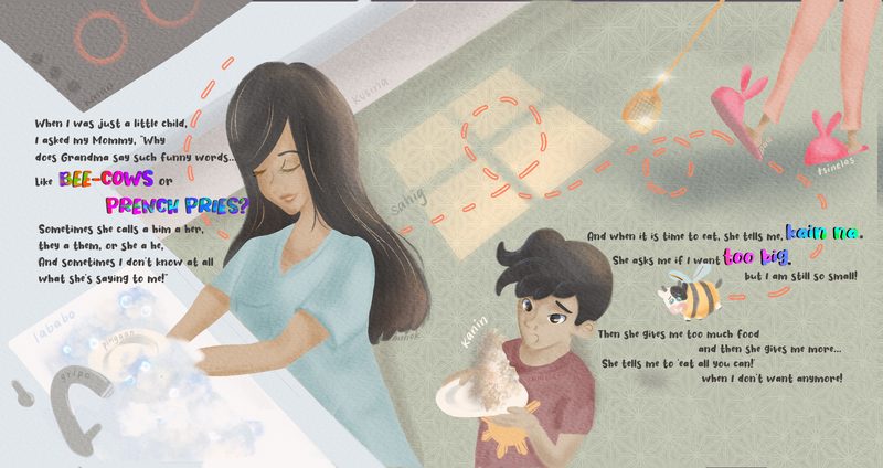
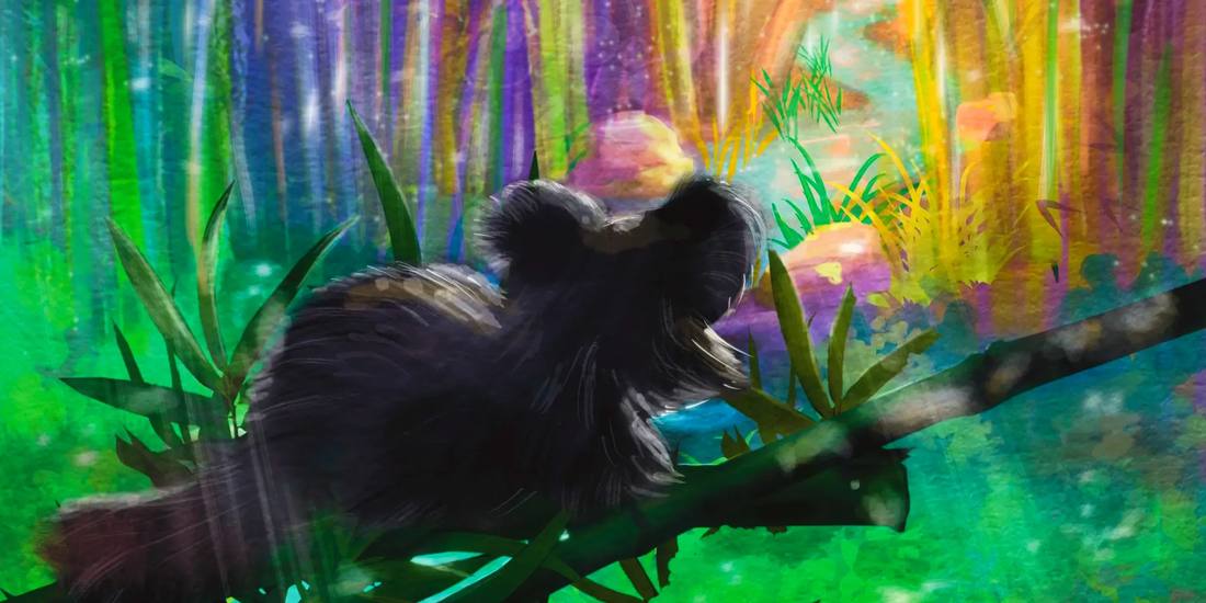
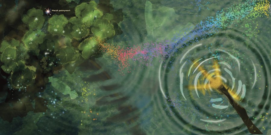
Three published books, a full card-game illustration system, and my own watercolor field practice all live on the dedicated illustration page — built out for anyone reviewing the art specifically.
View full illustration portfolio →Four brands, built from the ground up.
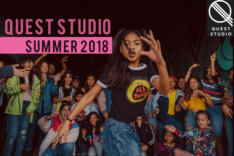
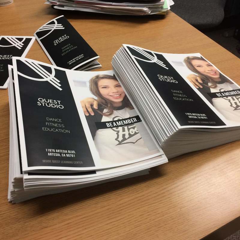
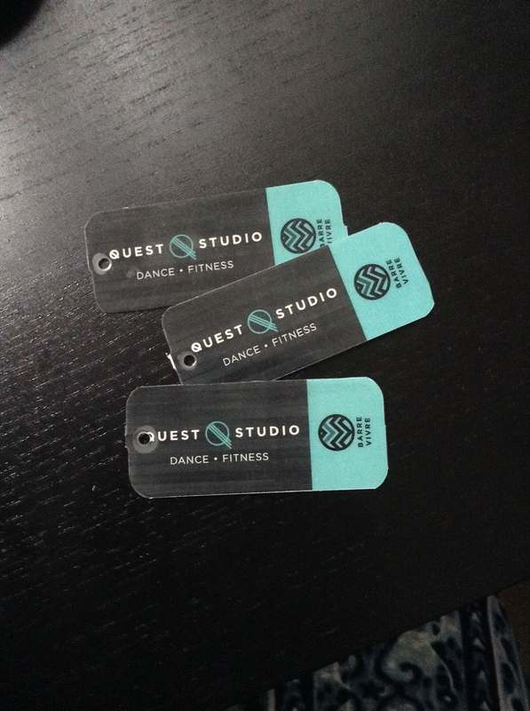
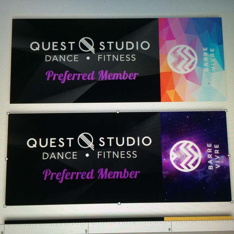
Same hand, four completely different voices. Salo Salo Sabotage is playful and product-forward, built to sell a physical game. Quest Dance is editorial and dark. Barre Vivre is bold, direct, fitness-forward. Ren DLC is warm, cultural, built around a specific kind of storytelling. You wouldn't know they came from the same place. That's the point.
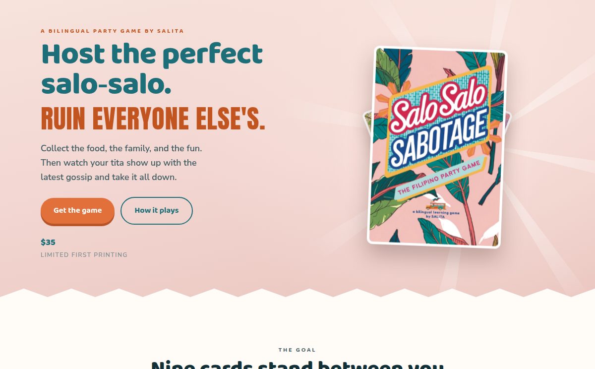
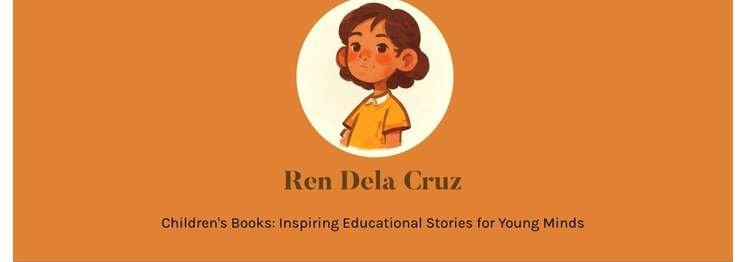
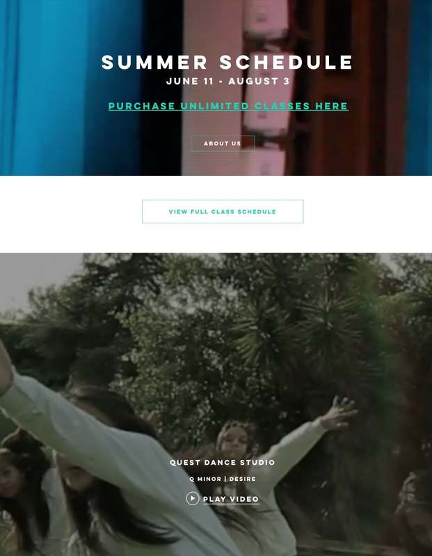
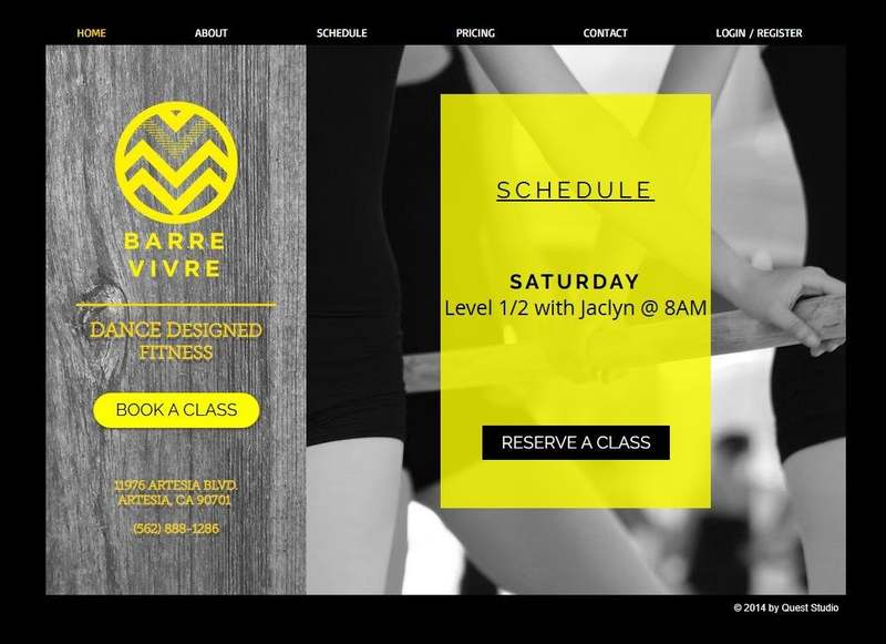
The full brand system extended well beyond the website.
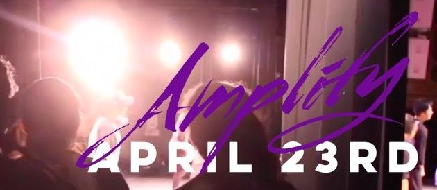
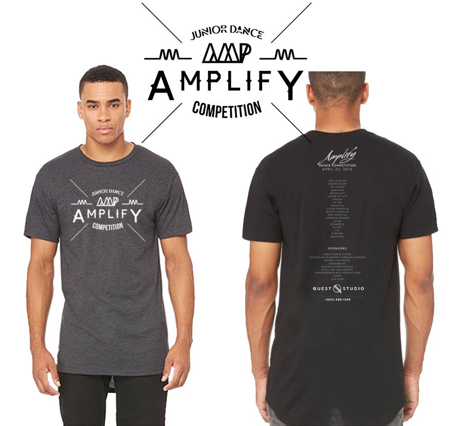
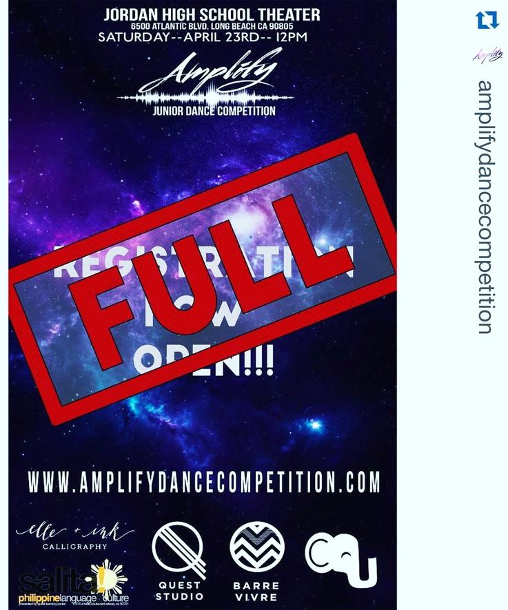
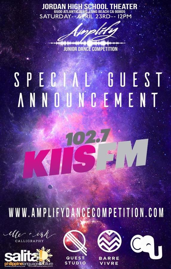
Amplify Dance Competition
The venue fell through with marketing already live and registration sold out. What could have been a public failure became the year people still talk about.
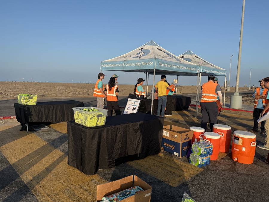
Bolsa Chica Conservancy
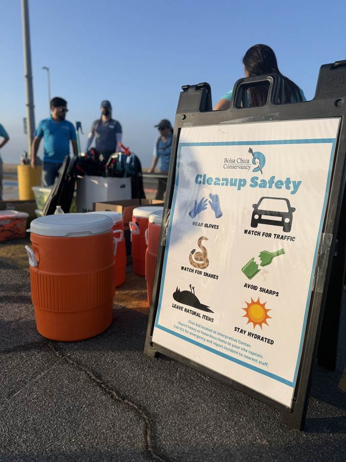
The contract was to fix a volunteer program that had outgrown what it was running on — and fix it without spending money.
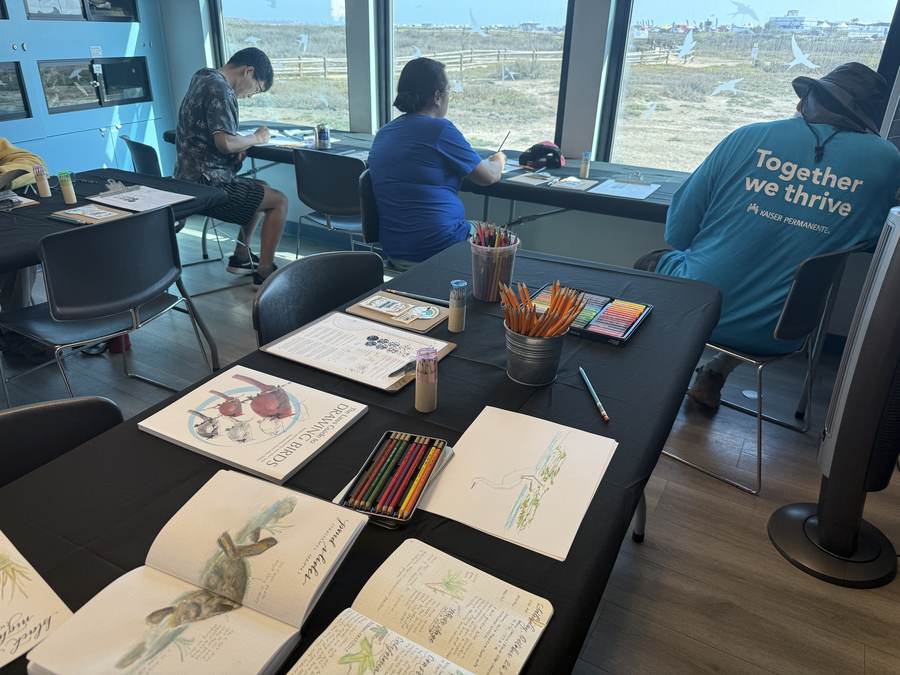
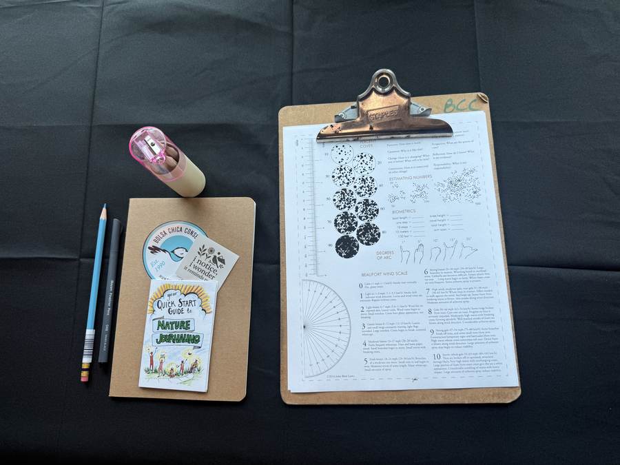
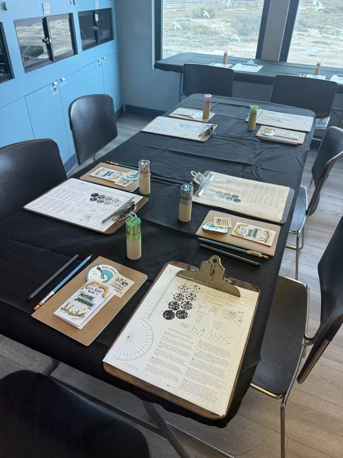
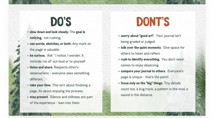
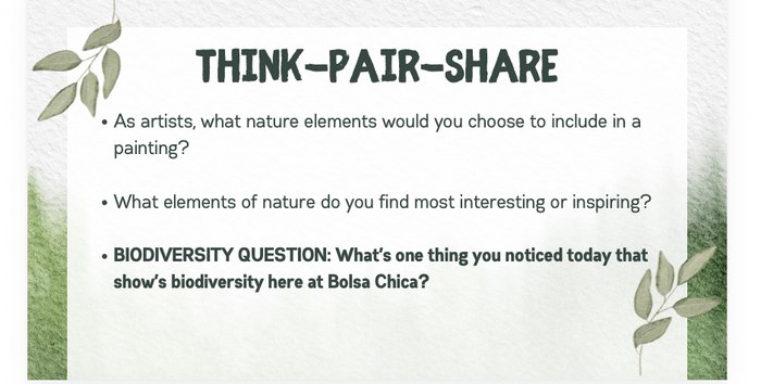
I'm a Certified Nature Journal Educator through the Wild Wonder Foundation (John Muir Laws) — this workshop is where that training met an actual conservancy program.
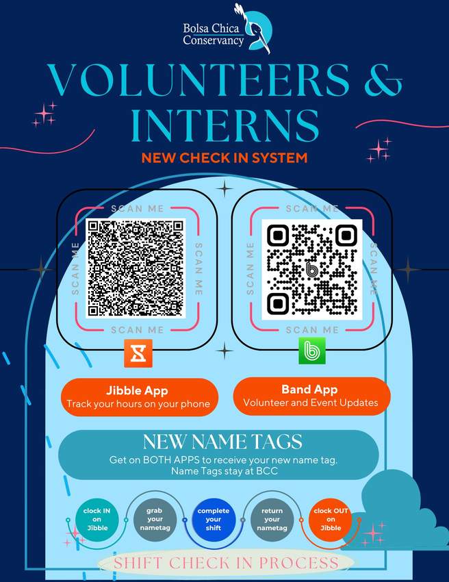
Band App — real-time communications
Newsletter — central hub, replaced email flood
Replaced: CharityProud (paid subscription)
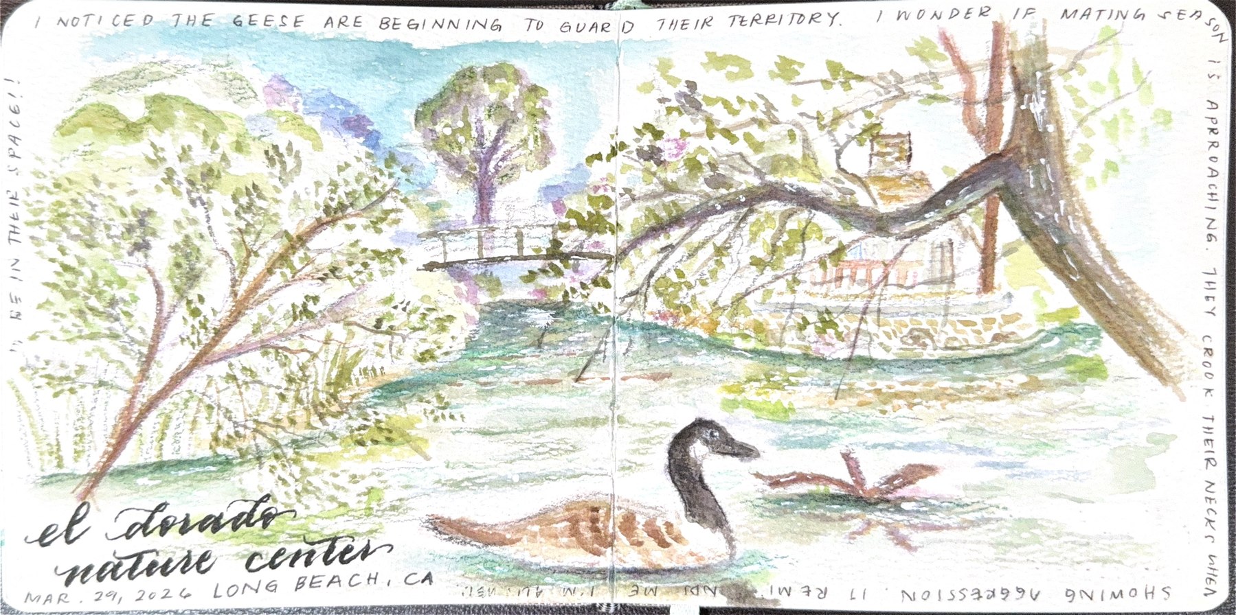
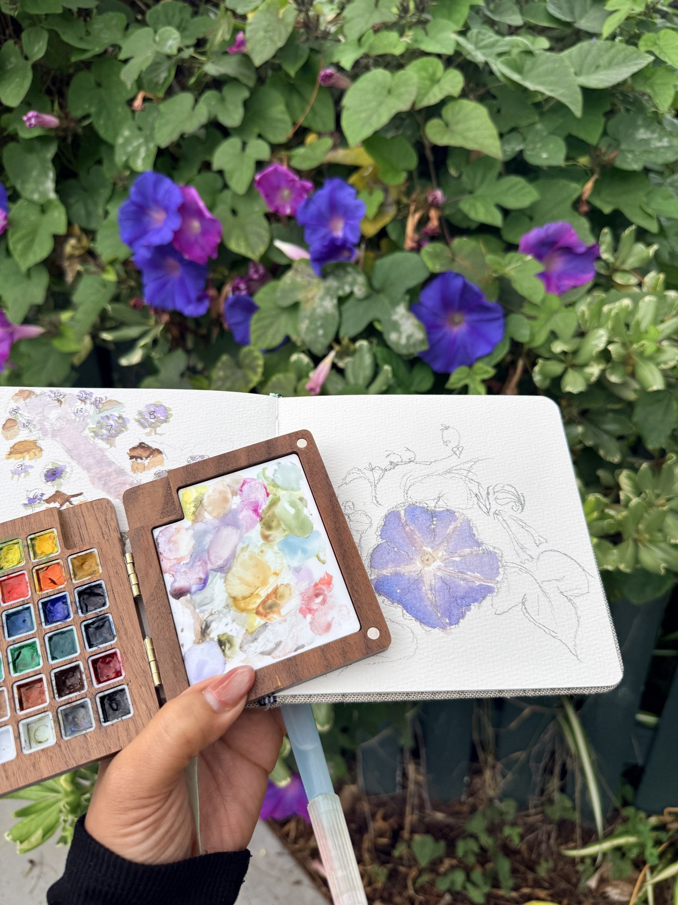
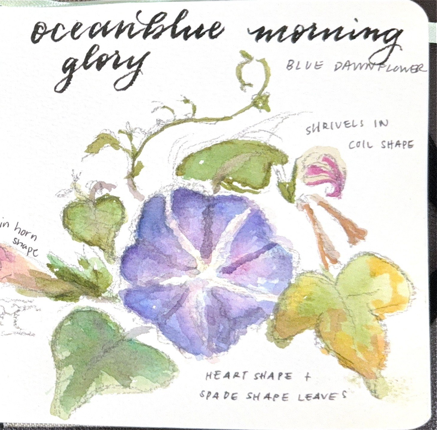
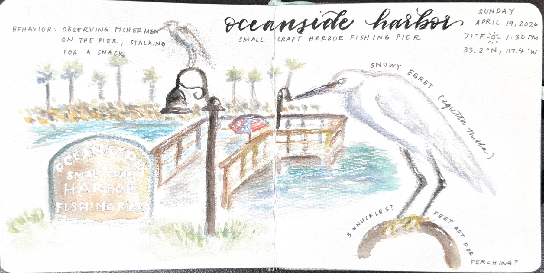
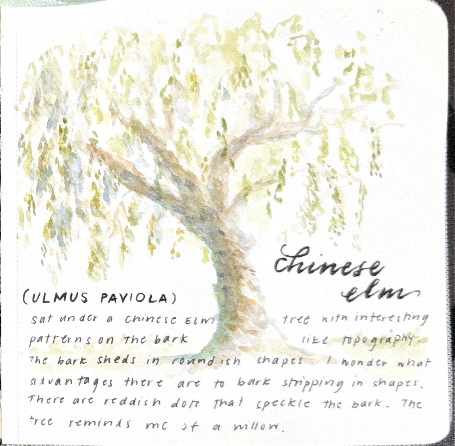
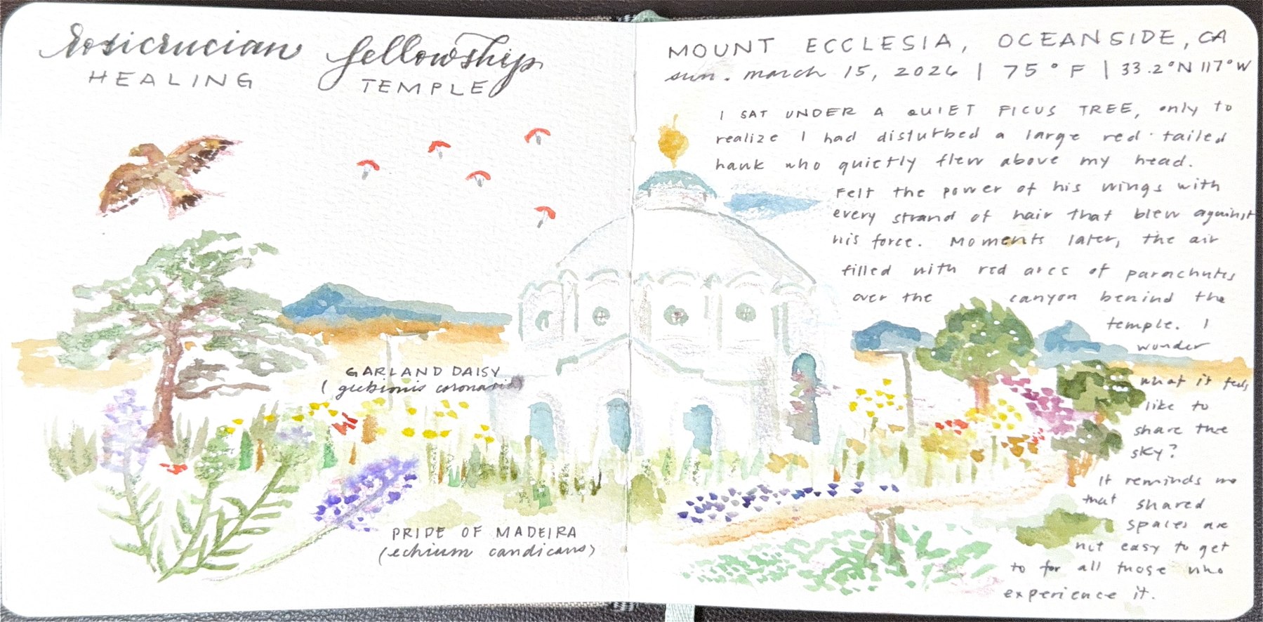
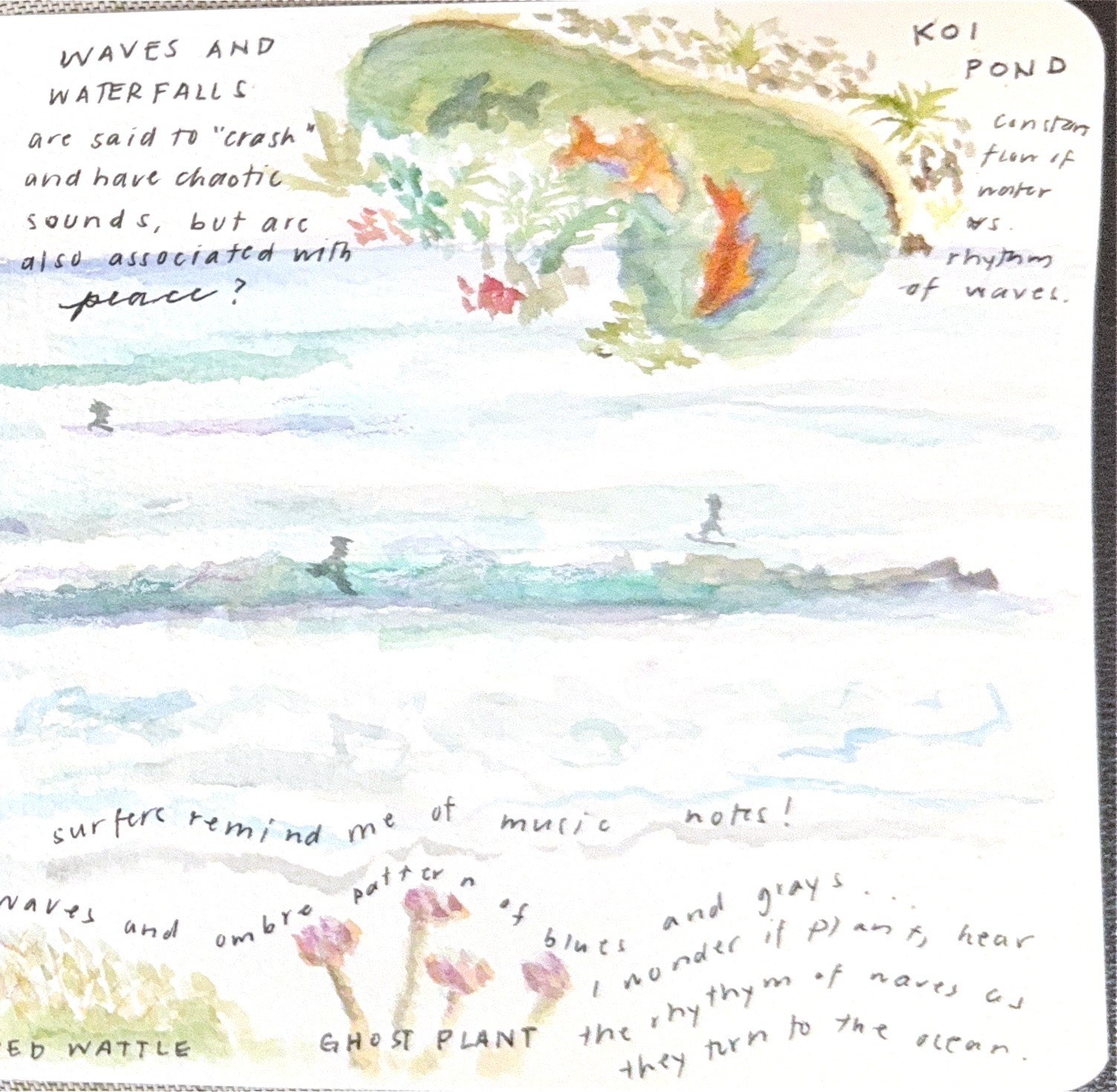
The workshop above runs on a practice I keep up on my own — not just at Bolsa Chica, but wherever I end up with a sketchbook, on location, in whatever light and weather shows up. These pages are from my own journal, not classroom material. See more on the illustration page →
It's where I find my peace. When everything is moving and there's a lot expected of me, sitting outside with watercolors forces me to slow down and actually appreciate what's in front of me.
The roles that built the range.
Most recent full-time role: Bolsa Chica Conservancy, through May 2025. Salita, Quest Studio, and Elle + Ink Events are mine — built and run alongside full-time work, not instead of it. Right now that means building Salita full-time. I'm open to the right creative or program leadership role.
- Directed operations for a $20M+ annual venue running 150+ events per week
- Led cross-functional teams across operations, culinary, and service
- Increased revenue 400% through strategic event programming
- Managed events with up to 5,000+ attendees
- Lead development of books, games, and narrative podcast
- Built scalable workflows for creative production and prototyping
- Developed brand identity across print, digital, and audio
- Integrated AI tools to streamline content development
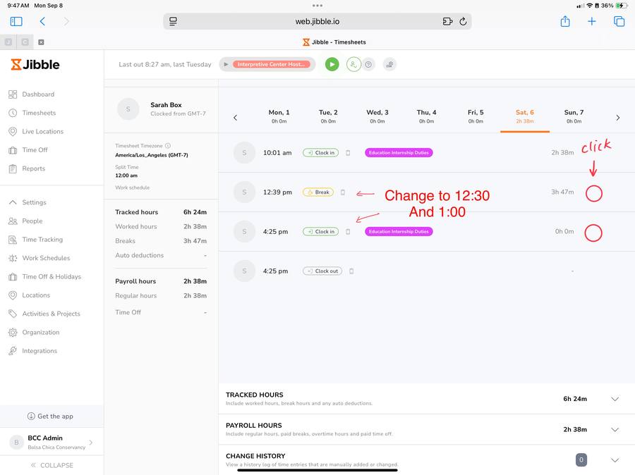
- Migrated volunteer system to free platform stack; eliminated subscription cost
- Improved volunteer onboarding and long-term retention by 25–30%
- Coordinated 300+ volunteer beach cleanup events
- Built intern pipelines with AmeriCorps and universities including UCI, Chapman University, and Vanguard University
- Ran California Naturalist certification cohort; graduates fed directly into volunteer program
- Built Quest Studio from 2 weekly classes to 12 daily — 200% enrollment growth
- Designed and executed productions with 3,000+ attendees
- Featured by ABC and World of Dance
- Secured and managed $125K+ in grant funding serving 1,500+ students across multiple school sites
- Coordinated grant-funded educational programs aligned with partner school requirements and timelines
- Implemented tracking systems ensuring compliance, audit readiness, and funder reporting
- Event designs featured in New York Fashion Week 2018, WSJ Magazine, and Modern Luxury Magazine
- Designed custom branding and print materials via Adobe Suite
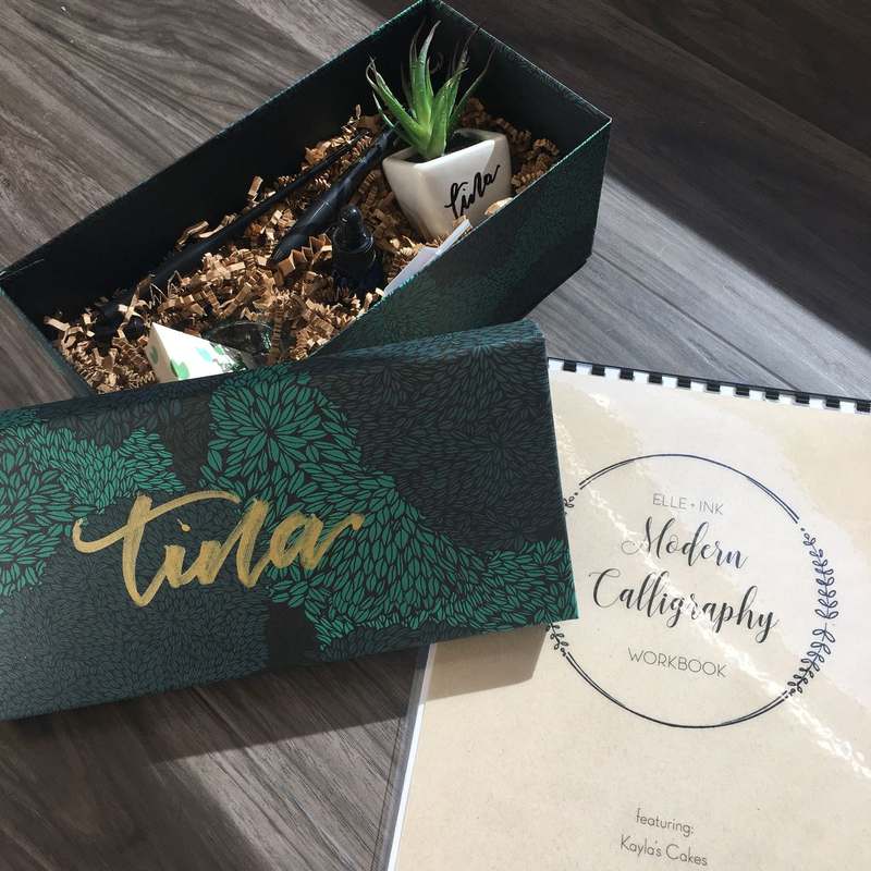
- Designed the Modern Calligraphy workshop curriculum, event kit, and branded gift box
- Managed client relationships, timelines, and creative direction
- Expanded visual and performing arts programs from 1 to 4 schools, serving 500+ students annually
- Managed budgets, fundraising, and resource allocation in compliance with public-sector requirements
- Built partnerships with district schools, charter schools, and external arts organizations
- Maintained classroom teaching responsibilities — Science and Dance — alongside district leadership duties
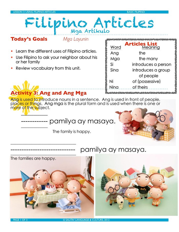
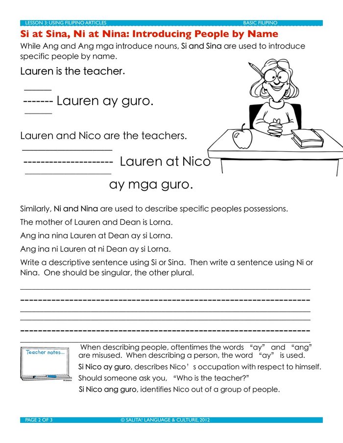
Built to be taught, not just read.
Design work isn't only brand and event work. These are two pieces of instructional design, built for two very different audiences — a heritage language classroom and a volunteer conservancy program. Both start from the same place: a clear goal, a structure that gets people there, and enough scaffolding that someone else could pick it up and teach it.
"Lauren held students to high expectations while providing the encouragement, structure, and guidance necessary for them to succeed."
— Dr. Crechena Wise, Principal, Cerritos High School
Lauren is Ren's full first name — from her time teaching dance and science at Cerritos High School.
The credentials.
Let's work together.
Creative direction. Program management. Cultural content.
If the project has something real at stake — a community, a culture, a story that matters — that's the lane. I work best when the project matters — to the people making it and the people it reaches.
If anything on this page made you want to slow down, pick up a book, learn a language, sit outside for a while, or just take a breath alongside someone who's building something with you — that's the energy I want to bring to the work too.